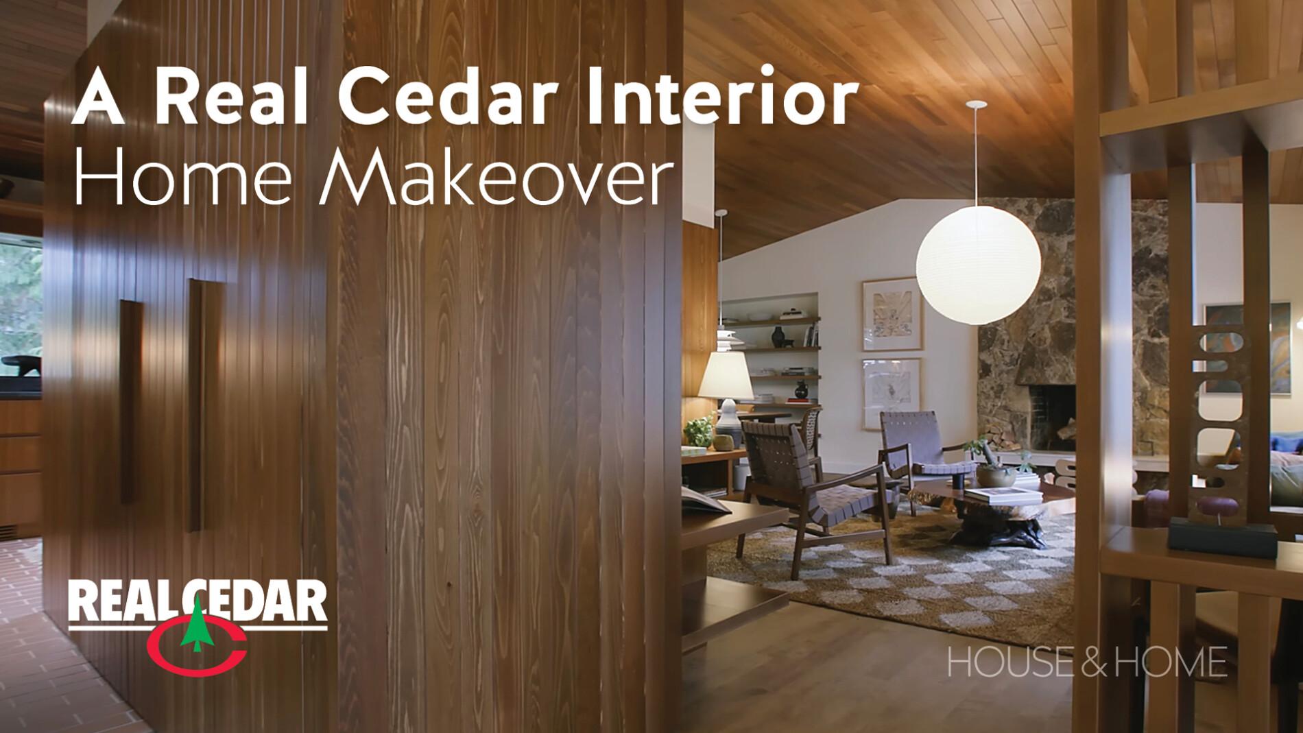
House & Home’s Emma Reddington Updates Her Mid-Century Modern Home without Sacrificing its Retro Roots
As House & Home’s deputy editor, Emma Reddington knows a thing or two about creating spaces that not only look good but feel good. When she first laid eyes on her North Vancouver fixer-upper, she saw beyond its dated décor and envisioned a contemporary West Coast haven that honored the home’s mid-century modern roots. So, she teamed up with dynamic duo, designers Darcy Hanna and Emma Sims from &Daughters, and together they embarked on a transformative journey.
Their muse? They all agreed that the home’s original cedar ceiling was everything! Recognizing its potential to redefine the space, they leveraged the wood’s timeless appeal to guide the home’s transformation. This decision showcased not only Emma’s respect for the home’s architectural roots but also her forward-thinking approach to design. By integrating cedar walls instead of defaulting to traditional white paint, Emma crafted a dialogue between the home’s interior and its wooded surroundings, marrying aesthetic appeal with the calming presence of nature.
“The grain on the cedar walls is just really beautiful and just adds some extra depth and texture to the house,” she shares in her Before & After video.
Creating Healthy Spaces with Biophilic Materials
In addition to aesthetic appeal, Emma’s choice to incorporate cedar so extensively was driven by her deep understanding of biophilic design—a principle that she not only advocates for but embodies in her work. This design philosophy, which emphasizes the integration of natural elements into built environments to promote health and well-being, became an integral part of the renovation. Through her vision, the home transformed into a living embodiment of biophilic design, offering a serene retreat that blurs the lines between indoor and outdoor living.
“Biophilic design is a really big thing right now,” she says. “And cedar is a great way for us to bring that nature from outside into our house and give us a sense of well-being, helps reduce stress and it just feels really great.”
Using Cedar for Bed, Bath and Beyond
Another interesting focal point is a cedar slat wall in the foyer, creating an organic space for keys and everyday essentials, merging functionality with natural beauty. They retained the original floor plan, adding a cedar wall in the living room to carve out a cozy reading nook complete with shelving and bench seating.
As well, the design team’s ingenuity turned an awkward niche in the dining room into a striking feature with thick cedar shelves, a decision that paid off beautifully.
In the principal bedroom, cedar paneling on the bottom half of the wall doubles as a headboard with built-in side tables, bringing warmth and texture to the space. The ensuite bathroom features a cedar vanity and side shelves, creating a visually stunning contrast with modern terracotta tiling.
There’s also a built-in cedar desk in their flex room, demonstrating how the team brought back cedar through a modern lens, enhancing the home’s character while staying true to contemporary design sensibilities.
All this thoughtful use of cedar throughout Emma’s home, from eye-catching statement walls to the more understated accents, has created a seamless blend with the surrounding nature. And they did it all without sacrificing the home’s architectural heritage. Reflecting on the transformation, Emma couldn’t be happier with how everything turned out.
“I look around and I actually can’t believe that it’s my house,” she says before adding, “it just feels really good to be here.”